



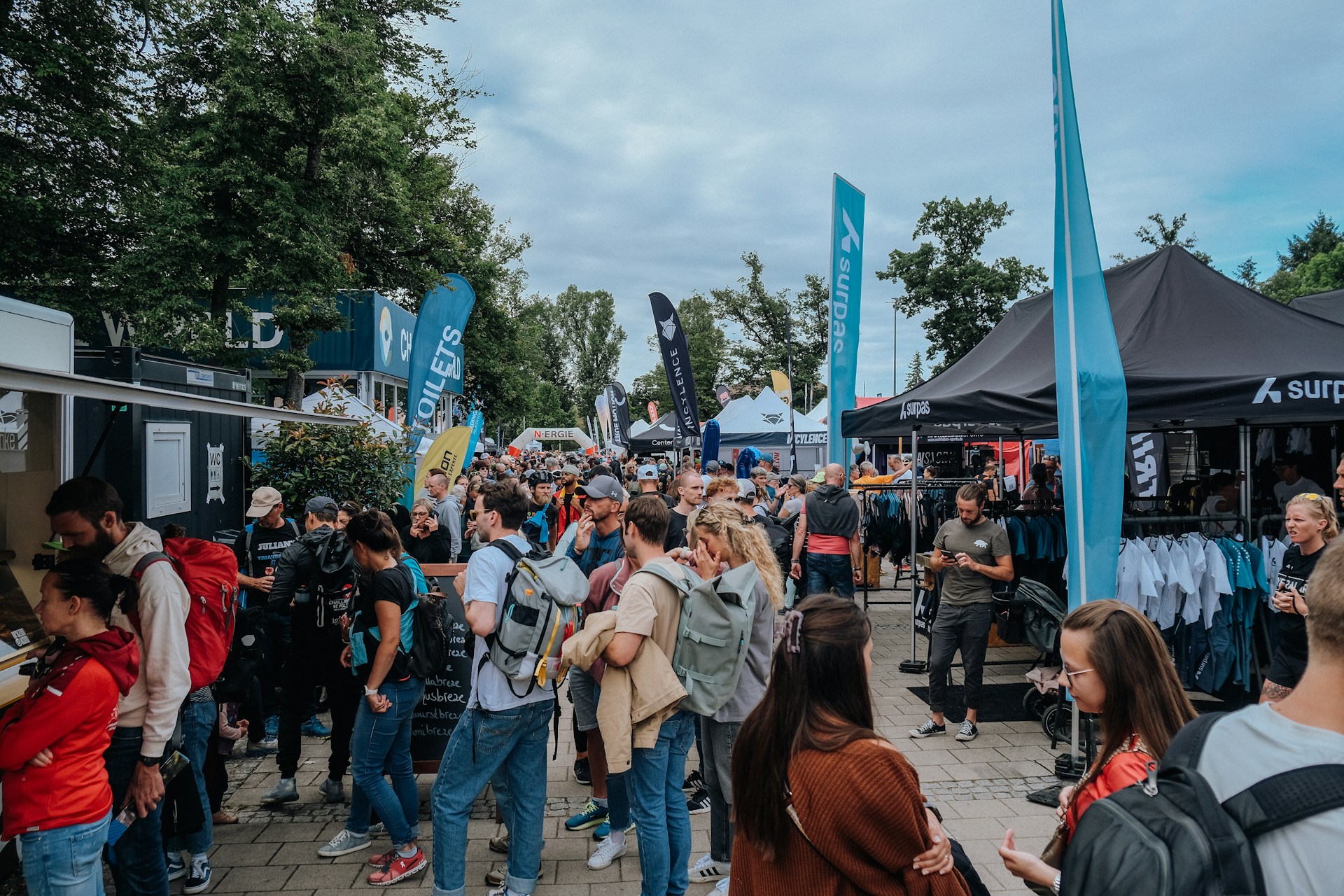
Make Every Square Foot Count: Rethinking Trade Show Graphics
Trade show graphics have to work hard. You might have a 10×10 at one show, a 10×20 at the next, then a big island booth later in the year. Redesigning your whole look for every floor plan is tiring, slow, and stressful for your team.
A smarter way is to plan graphics that scale. With one flexible system, your brand can look strong in a compact inline space and still feel big and bold in a larger island. As summer expos roll along and planning for busy fall and winter shows starts heating up, this is the perfect time to rethink how your graphics can adapt, not just survive.
Start with a Flexible Visual Strategy, Not a Booth Size
The first move is to plan your visual strategy before you think about square footage. Instead of asking, “What do we put in a 10×10?” start with, “What should our brand always say and look like?”
Key elements to define up front include:
- Logo usage and how much clear space it needs
- Color palette that feels like your brand at a glance
- Hero imagery that shows what you do or the outcome you create
- Simple, readable typography for headlines and body copy
Once you have that, build a clear visual hierarchy that can stretch or shrink. Think in layers:
- Primary brand zone: logo and one key message
- Secondary zones: product highlights, benefits, or proof points
- Tertiary details: website, QR code, social handles, booth number
Then, organize your words in modules. Start with one overarching statement that appears in every booth, no matter the size. Around it, create short support lines that can be added or removed depending on space. This keeps things calm and clear in a small booth and more detailed when you have room.
When your products change or your focus shifts, this system pays off. You can update a single fabric panel, graphic skin, or small insert instead of redoing every inch of your backwall.
Designing Trade Show Graphics That Scale From 10×10 to Island
Now, let’s take that flexible strategy and turn it into physical graphics. A great approach is to design a base kit that fits your smallest inline space first. That kit can then reconfigure into larger layouts using modular frames, tension fabric systems, and add-on panels.
Here are some practical layout tips that work across sizes:
- Keep your main logo and headline in a center-safe zone, where it will always show
- Avoid putting faces, logos, or key words right on seams
- Treat outer edges as bonus space that can be hidden or revealed depending on booth width
Patterns and color help a lot here. Repeatable patterns, soft gradients, or bold color blocks look complete even if you only see part of them. In a 10×10, you might only see the center and one side panel. In a 10×20 or island, you see more of the pattern, and it feels bigger, not broken.
Think vertically too. For larger peninsula or island booths, you want top headers that can be seen over crowds. For smaller inline spaces, focus on mid height messaging that hits eye level along the aisle. Many brands in busy expo halls forget that people read left to right and roughly eye to shoulder height. Use that band for your most important line.
Modular Messaging: Building a Reusable Graphic Toolkit
Instead of thinking of your booth as one giant graphic, think of it as a toolkit you can rearrange. Build a graphic library of mix-and-match pieces, such as:
- Main backwall graphics with your core brand story
- Product feature panels that zoom in on one service or benefit
- Testimonial or stats panels that offer social proof
- Interchangeable call-to-action graphics with QR codes or promo highlights
Pick a few standard sizes for these pieces so they can move between different hardware. For example, you might choose 3 to 5 standard panel widths or fabric skins that work on backwalls, banner stands, kiosks, and towers. When a new show comes up, you are simply picking pieces from your library, not starting from a blank page.
To keep this system flexible over time, use your largest areas for timeless visuals, like brand colors, patterns, or big lifestyle imagery. Save smaller, easy-to-swap pieces for show specific offers, seasonal themes, or regional messages. Magnetic graphics, SEG inserts, counter wraps, or small headers are perfect for this.
On the file side, good organization saves headaches. Use clear naming rules for panels, keep layers tidy, and lock in color profiles that match your trade show materials. That way your team, or a partner like us at First Trade Show, can quickly adjust layouts for a new booth size without guesswork.
Visual Impact Rules: Readability, Contrast, and Lighting
No matter how flexible your system is, it still has to be easy to read from the aisle. People are walking by fast, often in crowded halls with mixed lighting and a lot of visual noise.
A few simple rules go a long way:
- Keep headlines short, about 5 to 7 words
- Make key type large enough to read from a distance
- Leave generous negative space around important messages
For color, aim for high contrast. Avoid light text on slightly lighter backgrounds or dark text on slightly darker images. Test your graphics in both bright and dim light, because exhibit halls can be unpredictable. Sometimes one area feels like daylight while another feels like a movie theater.
Plan for lighting as you design, not after. Think about where spotlights or clamp lights might hit your booth and keep faces and logos out of those hot spots where they could wash out. Backlit fabric graphics can be a flexible focal point in both small and large booths, so plan your strongest image or message for that area.
Seasonal timing matters too. For summer and early fall shows, brighter palettes and energetic visuals can help you stand out without feeling heavy in warmer weather. Just keep at least one calm color as a base so your booth does not feel too loud or tiring after a full day.
Plan Once, Reuse Often: Next Steps for Smarter Graphics
When you design trade show graphics as a scalable system, you get consistent branding from show to show, even as your booth footprints change. You also cut down on rush redesigns and last-minute layout scrambles when a new floor plan pops up.
A simple way to start is to audit what you have now. Spread out your current graphics and ask:
- What brand elements should always appear, no matter what?
- Which pieces could be modular panels instead of fixed parts of a big mural?
- Where could you add headers, side panels, or accessory graphics to give yourself more options?
From there, you can work with a consultative exhibit provider like First Trade Show to map out a multi-booth-size strategy and pick portable, modular hardware that supports your new graphic system. With a little planning now, your trade show graphics can flex from a 10×10 inline to a large island, while your brand always feels clear, confident, and ready for the next show on the calendar.
Get Started With Your Project Today
Bring your booth to life with custom trade show graphics that match your goals, budget, and timeline. At First Trade Show, we work with you to refine your message, choose the right materials, and create visuals that stand out in a crowded exhibit hall. If you are ready to move forward or have questions about options, just contact us and we will help you plan your next show with confidence.