



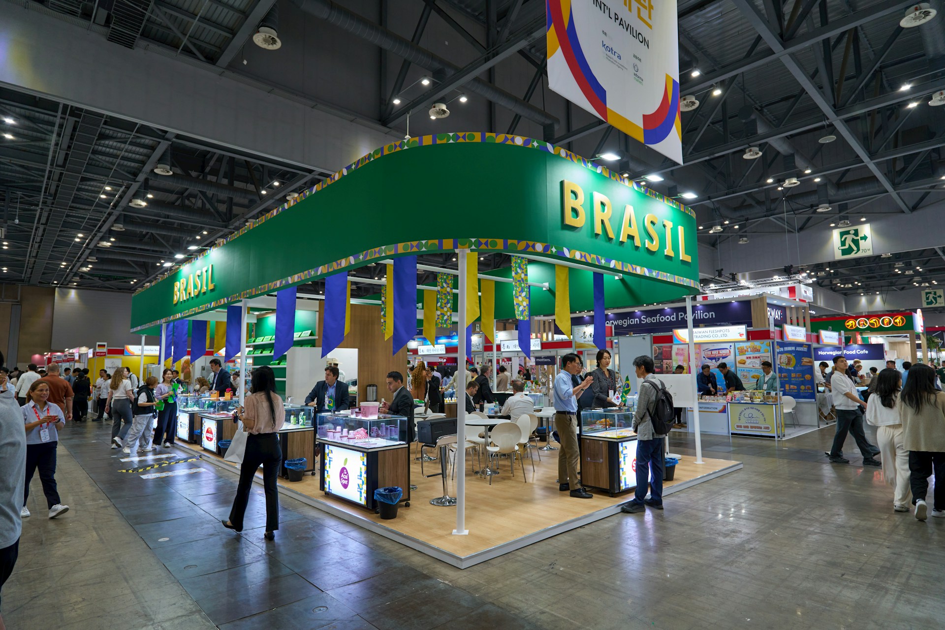
Turn Passing Foot Traffic Into Booth-Ready Visitors
Trade show graphics can make the difference between a steady stream of booth visitors and a long, quiet day on your feet. When aisles are packed, people are hot, tired, and moving fast; your display has only a few seconds to pull them in.
Summer shows are especially intense. Bright lights, busy schedules, and crowded aisles mean most attendees are half-looking at their phones while they walk. Many booths fade into the background, with tiny text, weak colors, and so many messages that no one reads any of them.
Smart trade show graphics flip that story. With the right layout, words, and visuals, you can turn quick sideways glances into real interest and real conversations. In this article, we will break down how to make graphics that work on a busy show floor, and how you can use these ideas as you gear up for late-summer and fall events.
Readability Rules That Stop People in Their Tracks
First, your graphics must be easy to read while people are moving. If someone has to slow down and squint, you already lost them.
Here are the basics we care about when we design:
- Big, clean fonts that are easy to read from 20 to 50 feet away
- Simple sans serif typefaces, not fancy scripts or skinny letters
- Strong contrast between text and background so words pop
Think about how people move down the aisle. They are usually looking forward, not up close at your booth. That means:
- One main headline at the top, large and clear
- A short support line under it, in smaller type
- Almost no body copy on the main structure
We want the eye to know where to go first. Too many font styles or tiny blocks of text turn your graphics into visual noise. When everything is loud, nothing is heard.
Layout matters too. Keep key messages above eye level and centered, where people notice them as they approach. Avoid clutter near the edges of your backwall or banner stand, since those areas often get cut off by neighboring booths or crowd traffic. Align text in a simple way, so the reading path is obvious and smooth.
Color, Contrast, and Images That Make Your Brand Pop
Once your words are readable, color and imagery help you stand out from the sea of similar booths. Many venues mix natural daylight with strong indoor lighting, and weak colors can look washed out under those conditions.
We like to build around bold, brand-consistent colors that feel like you, not random shades picked at the last minute. A few smart moves go a long way:
- Use one main color from your brand to anchor the booth
- Add one or two accent colors to guide the eye to key areas
- Avoid pale text on pale backgrounds that disappear at a distance
High contrast is your friend, especially for headlines and calls to action. Dark text on a light background, or light text on a rich, dark color, gives fast clarity. Busy photos behind text, on the other hand, make words hard to read, so we keep type on clean fields when we can.
For images, less really is more. One or two strong, high-resolution visuals say more than a collage of small, generic stock shots. Your main image should quickly answer two questions: What do you do, and who do you do it for?
For example, an image of your product in use, or a clear scene from your service environment, is usually better than abstract graphics with no clear meaning. Large, simple visuals also print better and stay sharp on big surfaces.
Crafting Messages Attendees Can Grasp in Three Seconds
We use a simple rule for trade show graphics: if someone cannot understand what you offer in three seconds or less, the message is not clear enough.
That means your headline should talk about a benefit, not just a vague slogan. Think of phrases like:
- “Cut Your Procurement Time in Half”
- “Stop Losing Leads After the Show”
- “Faster, Cleaner Parts for Your Production Line”
Short, plain language works best. You are not writing a brochure on your backwall. You are starting a thought in the attendee’s mind so they want to step in and ask a question.
Keep your copy focused on the problem you solve or the result you deliver. Direct language, like “Save hours every week” or “Reduce errors in your process,” connects much faster than buzzwords.
Placement matters too. We like to put the core benefit message:
- High and centered on the backwall
- Repeated on a hanging sign or tower if you have one
- Echoed on a front counter or kiosk at eye level when someone stands in the aisle
Repeating a short, memorable phrase across a few key places helps people remember you later, even after walking rows of booths.
Seasonal Strategy: Graphics That Work Year-Round
Mid-year is when many teams start gearing up for a heavier late-summer and fall show calendar. This is the best time to rethink your graphics, not just reprint the same old files.
We like to plan graphics as a system, so you can adjust for different events without starting from scratch each time. Modular design can mean:
- Swappable header panels for different shows or verticals
- Interchangeable side graphics that feature seasonal promos
- Accessory graphics, like tablet stand panels or counter wraps, that you can rotate
This way, you can use a strong core look at both smaller regional shows and larger national events, while still tailoring messages to each audience.
Practical details matter, especially when the weather is hot and travel is heavy. It helps to:
- Work backward from show dates so print and shipping deadlines are not rushed
- Review color proofs and think about how your palette will look in different lighting
- Match show graphics with any summer promotions, product launches, or end-of-year campaigns you have planned
In our own work at First Trade Show, based in the Northeast, we see how humidity, changing light, and tight travel windows affect real events. Planning ahead gives you more control over how your booth looks and performs.
Turn Your Next Booth Into a High-Impact Magnet
When we step back, the blueprint for effective trade show graphics is simple but powerful: clear hierarchy, bold and on-brand color, benefit-first messaging, and layouts that respect how people actually move through the floor.
Before your next event, walk through a quick self-check:
- Can you read your main headline from across the aisle?
- Is the main benefit obvious within three seconds?
- Are there extra words, icons, or images that could be removed?
- Do your colors and images feel like a strong, united brand, not a mix of random pieces?
Treat your booth as an active tool, not just a backdrop. When your graphics do the heavy lifting, your team can spend more time talking with qualified visitors and less time trying to explain what you do from scratch. That is how a busy show floor turns from random foot traffic into steady, booth-ready conversations.
Get Started With Your Project Today
Bring your next exhibit to life with custom trade show graphics tailored to your brand and audience. At First Trade Show, we work with you to create visuals that make your booth stand out and support your sales goals. If you have questions or need help choosing the right options, just contact us. Let’s turn your next trade show into a high-impact, high-return experience.