



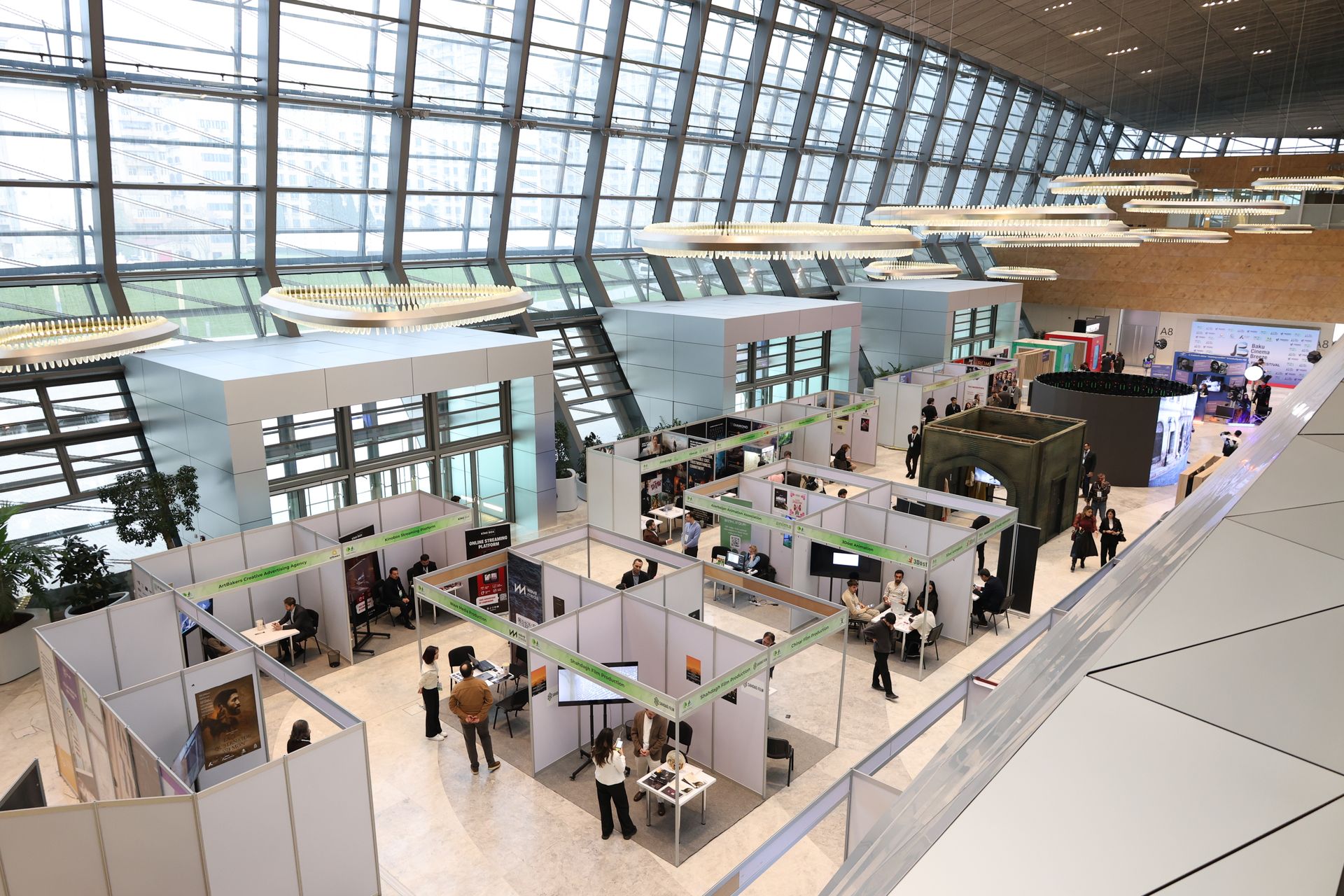
Trade shows are full of movement, sound, and color. Everywhere you look, there’s a sign, banner, or screen calling for attention. With so much going on, it’s easy for a booth to get lost in the noise, or worse, to overload visitors with too much visual clutter. The truth is, more graphics don’t always help. Sometimes, they do the opposite.
Using graphics for trade shows works best when the visuals are clear, well-placed, and used with purpose. A clean booth layout with the right message draws people in without making them feel pulled in too many directions. That kind of balance doesn’t happen by accident. It takes planning, smart design, and knowing when to hold back. Here’s how we think through what to show, and just as importantly, what not to show.
Keep the Message Simple
Too many signs with too many words can turn a booth into background noise. Trade shows move fast. People are walking, talking, reading, and scanning all at once. That’s why we stick to one main point per graphic. When someone stops at our booth, we want the message to be clear right away.
- Each sign should highlight one idea instead of cramming in product features or full descriptions
- Short phrases that make sense at a glance work much better than long blocks of text
- When we use a strong image or word, we make sure it stands out by leaving space around it
Graphics don’t need to explain everything. They only need to get someone to pause long enough to ask a question or look closer. The rest happens in the conversation, not on the banner. When you keep things easy to read, visitors feel invited, not pushed away. It gives them space to focus and makes their visit more comfortable.
Use Graphics to Guide Visitor Flow
Sometimes the way a booth is set up matters more than how big or bold the visuals are. A few clear visuals, placed in the right spots, can help guide where people walk, stand, or stop to look. We think about traffic flow and movement just as much as the look of the designs.
- Graphics near the booth edge should invite people in, not stop them in their tracks
- Arrows, lines, or shaped signs can help point toward product displays or speaking areas
- We avoid stacking all visuals in one corner or blocking walkways with big signs
We want our booth to feel open and easy to enter. When signs are doing too much or placed in the wrong spot, people hesitate. Clear paths, with gentle nudges from the graphics, keep the booth feeling natural and easy to explore. If visitors can move smoothly and see where to go next, they are much more likely to linger, interact, and enjoy what you want to show them.
Match Graphic Design to Booth Size and Shape
Graphics should feel like part of the booth, not pasted on top. The colors, spacing, and layout need to match the size of the space. When things feel balanced, they catch the eye without feeling loud or off-balance.
- For smaller booths, we use clean designs with open space to keep things from feeling tight
- In larger exhibits, we fill long walls with bold images or repeating themes without overdoing the text
- Vertical space matters, tall graphics can help in crowded aisles, but not if they stack too much info
Instead of using every inch of space, we leave breaks in between designs. That breathing room makes the message feel calmer, even when the booth is full. And when the space is calm, visitors stay longer and ask more questions. The right balance helps everyone relax and take in what’s on display rather than feeling overwhelmed by a busy wall of information.
Our tension fabric displays are printed with high-resolution graphics and can be customized to fit standard and unique booth shapes. Dye-sublimated fabrics create bold, accurate color and are lightweight enough for easy transport and fast changes between events.
Don’t Rely on Graphics Alone
Displays are helpful, but the real draw comes from what’s behind the graphic. We always make sure our products, samples, or people have room to take the spotlight. Graphics are there to support, not lead the whole show.
- An in-person demo or product sample usually says more than a printed list of features
- We use lighting to call attention to key spaces instead of trying to “say it all” with signs
- Our team talks to visitors directly, instead of standing back and letting signs do all the work
Even the best design can’t replace a good conversation or a hands-on moment. Graphics should be the start, not the full story. They make a nice first impression and set a mood, but it’s the chance to talk, watch, and try that builds trust and interest. Good booth layouts combine strong visuals and friendly, helpful people in a way that feels natural and welcoming.
Let Pros Help Keep It Balanced
We’ve learned that planning a trade show booth works better when designers who understand the space are involved early. Choosing colors, layouts, or print sizes might seem simple, but it changes how people experience the booth. A second opinion from someone who knows trade shows can make a big difference.
- We ask for mockups in real booth dimensions so we can picture the setup before show day
- Testing things out helps us find what feels balanced and what feels bus
- Keeping fonts, colors, and tone consistent across banners and signs makes everything feel more put together
Trade shows move fast, both in planning and on the event floor. When each piece works together, the booth feels focused and easy, not crammed or cluttered. That kind of impression builds trust fast. Taking the time to talk with design experts from the very start saves effort later, catches small problems before they get big, and leads to a more polished look on the actual event day.
For display graphics, we offer full design assistance, with options for creative, large-format printing, and color-matched proofs to make sure visuals turn out exactly as expected.
Find the Right Visual Mix for a Clean, Clear Booth
The goal isn’t to impress visitors with the number of signs we use. It’s to create a space that feels clear, open, and worth stopping for. That means using graphics for trade shows in a way that supports, not replaces, honest interaction.
The right visuals can nudge someone to start a conversation or look more closely. They can answer quick questions, or guide people through the space naturally. When everything lines up just right, your booth looks more polished, your team feels more confident, and your message actually reaches the people walking by. That kind of clarity is always worth the effort.
Designing a trade show booth that feels open, clear, and engaging starts with knowing how to use visuals the right way. We help businesses create thoughtful layouts where every element, from structure to lighting, works together to support connection. When it comes to booth design, less can truly say more, especially when you’re using the right graphics for trade shows in all the right places. At First Trade Show, we’re here to help you plan a setup that looks sharp and welcomes people in. Contact us to get started on a display that’s ready to work as hard as you do.