



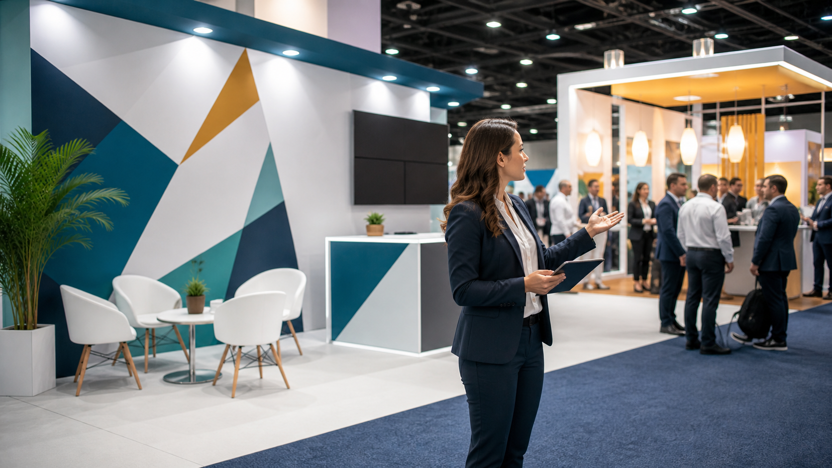
When Beautiful Booths Fail to Bring You Leads
Trade show graphics can look amazing and still leave your team standing in an empty booth. The floor is busy, the aisles are packed, your colors pop, and your logo looks sharp. Yet people glance over, keep walking, and never step in for a chat. That is not a design win. That is a missed sales chance.
Think about a typical fall show floor in late September. It is loud, crowded, and full of big, bright visuals. Some booths sparkle but stay strangely quiet, while others with simpler graphics are swamped with visitors. The difference is not just style; it is whether the visuals are doing a clear sales job for the people walking by.
At First Trade Show, we focus on exhibits, graphics, and accessories that do more than look good. We want your booth to support real goals like leads, meetings, and pipeline. In this article, we will walk through how to spot when your trade show graphics are failing you and how to reshape them so your next fall or Q4 shows work harder for your team.
Why Great-Looking Trade Show Graphics Still Miss the Mark
A common problem is that graphics are built to please internal teams, not the people in the aisle. Marketing, sales, and leadership often want every message, product, and tagline on the wall. The result may pass every internal review, but it still might not speak to a cold visitor at all.
On the show floor, there is a simple three-second rule. Someone walking by should be able to answer two things in about three seconds:
- What do you do?
- Why should I care?
If your main graphic does not do that, it is not working hard enough. A clever slogan or vague brand line may sound good in a meeting, but on the floor it often falls flat. People do not stop for mystery. They stop for clear value.
Some common ways nice graphics miss the mark:
- Cute, clever taglines that never mention a problem or result
- Product names that mean nothing to new prospects
- Big logos with tiny benefit copy tucked in a corner
- Busy art with no obvious point
Then there is visual overload. Too many colors, layers, and images tire the brain. When every inch of space is filled, attendees do not know where to look. In crowded fall shows, when aisles are packed and many buyers are trying to lock in year-end plans, clarity is gold. Your graphics need to work like a spotlight, not like a puzzle.
Silent Killers Hiding in Your Booth Messaging
Some problems are loud and obvious, like hard-to-read fonts. Others are quiet but deadly for your leads. We call these the silent killers.
Watch out for:
- Long paragraphs that no one will read while walking
- Buzzwords and jargon that sound fancy but say little
- Tiny body text that only works if someone steps right up and squints
- Big blocks of bullet points that look like a slide deck
If your graphic hierarchy is not clear, people get lost. There should be one main message that jumps out first. Then secondary points. Then small details. When everything on your wall feels the same size and weight, nothing feels important, and your core offer gets buried.
Inside language is another silent killer. Acronyms that only current customers know, product codes, or internal program names all make it harder for prospects to see themselves in your message. If they cannot quickly say “That is for me,” they will not stop.
Finally, weak or missing calls to action hurt conversion. Pretty graphics that never invite people to do something next are like friendly hosts who never open the door. Strong show-specific prompts might include:
- See a 3-minute live demo
- Grab a free sample today
- Get a quick strategy review at the counter
When these things are missing, you can have excellent art and still walk away with fewer scans and weaker talks than you deserve.
Turning Trade Show Graphics Into Lead Magnets
So how do we fix it? We like to start with a simple messaging frame:
- Who you help
- What you do
- The key result you deliver
Put that into one clear, bold line that someone can read from 10 to 20 feet away. For example, “We help busy sales teams book more qualified meetings” is much stronger than just “Innovative sales solutions.”
Then think about your booth as a visual path, not just a set of panels. Each part can play its own role.
- Overhead signs: big promise and who you serve
- Backwall: main benefit, proof points, simple visuals
- Counters and kiosks: focused offers and calls to action
Good design choices support this path. Use high contrast between text and background so your headline pops. Pick one main image that underscores your core result, instead of a collage of random shots. Limit copy so the booth feels open and calm.
Now layer in clear, intentional calls to action right on the graphics, not only on handouts or screens:
- Scan for show-only pricing
- Book a 15-minute consult today
- Test it yourself in 60 seconds
At First Trade Show, our team works with clients to connect visuals, words, and layout with real lead targets. We think about pre-show plans, at-show flow, and post-show follow-up while we design. That way, your booth does not just look sharp; it supports your whole event plan.
Testing, Measuring, and Improving Before the Next Show
The good news is you do not have to guess. You can test your graphics before the next show and keep improving over the season.
Here are a few simple steps:
- Share a mockup with people who do not know your product well
- Give them three seconds to look, then ask what they think you do
- Note any words they use that are different from yours
- Adjust your headline to match the way your best buyers talk
You can also try low-key A/B testing between events. Maybe you keep the same layout but change just the headline or the main image between a fall show and a winter show. Track which version leads to more qualified conversations or more demo requests.
Useful success checks include:
- Number of real talks per hour, not just quick badge scans
- How well scans match your ideal customer profile
- On-site demo bookings or meeting signups
- How many people answer follow-up emails or calls
Seasonal timing matters here. Many companies lock in next year budgets and vendor lists in late fall. Sharper, more focused graphics during those shows can point more of those decisions your way.
At First Trade Show, we often review existing booths and suggest targeted changes. Sometimes you do not need to start over. A stronger headline, cleaner hierarchy, and better placed call-to-action can wake up a booth that already has solid structure.
Upgrade Your Next Booth From Pretty to Profitable
The main point is simple. Trade show graphics that only look nice are not enough. To be worth the space, time, and travel, your booth has to spark engagement, start real talks, and support your sales team. Beauty is helpful, but clarity and purpose pay the bills.
Use this quick checklist as you review your current fall or Q4 graphics:
- One clear core message visible from down the aisle
- Obvious benefit that matters to your target buyers
- Simple, audience-friendly language with no insider terms
- A strong, visible call to action on at least one graphic panel
- Clean visual hierarchy so eyes know where to go first
Take a quiet hour with your team and walk through your booth plan. Look at it like a stranger in a crowded hall, not like someone who already knows the brand. Even one or two smart changes before the next show can help turn a silent, pretty backdrop into a busy, productive booth that actually supports your goals.
Get Started With Your Project Today
If you are ready to turn your booth into a true brand showcase, we are here to help you plan and produce high-impact trade show graphics that fit your goals and budget. At First Trade Show, we collaborate with you on sizes, materials, and layouts so every visual element works together on the floor. Tell us about your upcoming event and timeline, and we will recommend options that make setup simple and your message clear. Have questions or need a custom quote right away? Just contact us and our team will respond promptly.