



Stop Washed-Out Booths Before They Happen
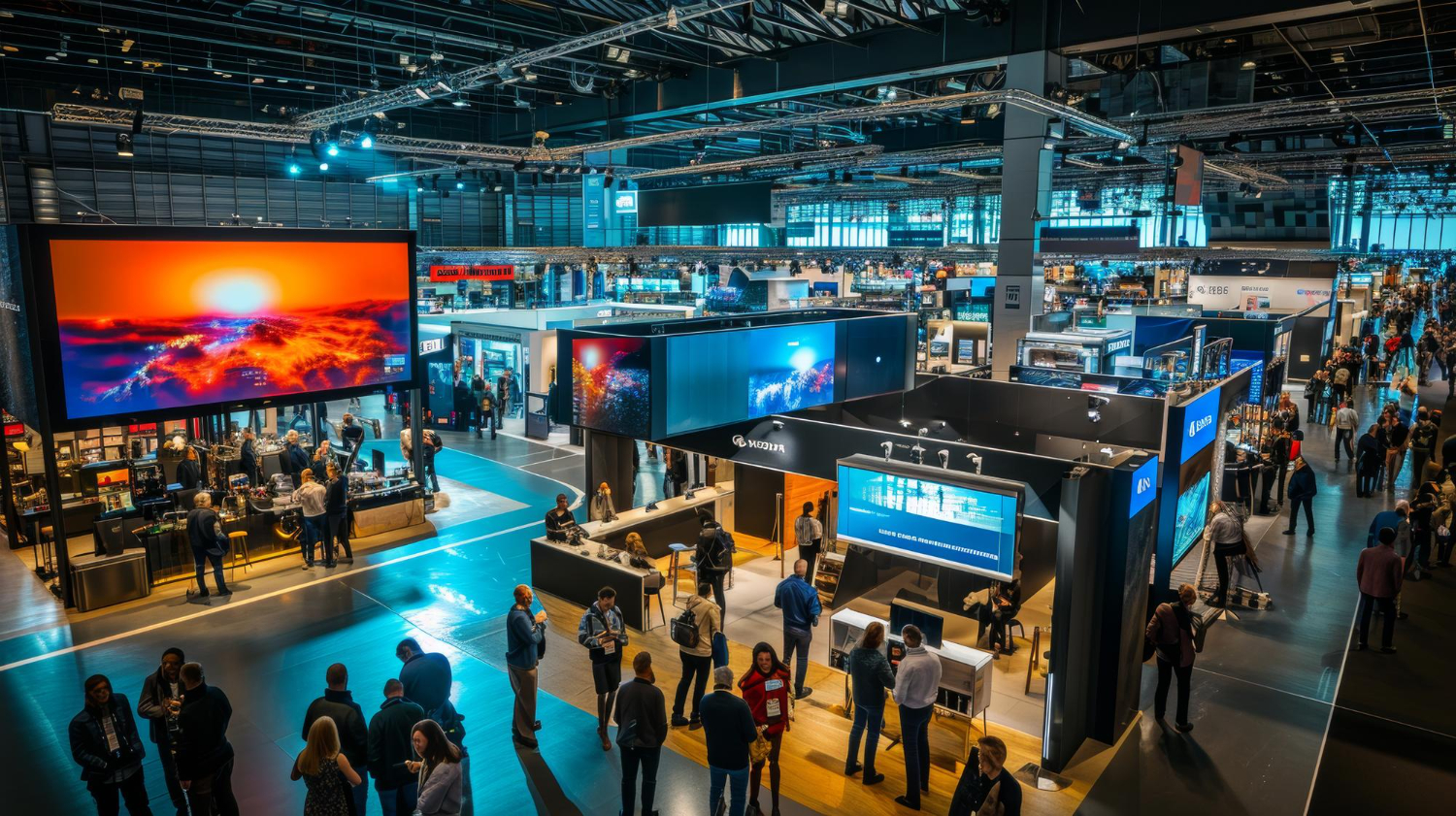
Bright trade-show halls are tough on graphics. Strong overhead LEDs, glowing video walls, and shiny floors can turn bold booth visuals into washed-out panels with harsh glare and hard-to-read text.
If you are planning for late-summer or fall shows, this gets even more intense. Longer hours and packed aisles mean the lights stay high, the crowds get closer, and any problem in your graphics is on full display. The good news is that you can catch most issues before a single full-size panel is printed.
In this article, we will walk through a simple way to test and tune trade show graphics before you commit to final production. We will talk about materials, finishes, and easy lighting mockups you can set up in an office or warehouse so you can see how your booth will really look on the show floor. At First Trade Show, we design and supply custom exhibits and graphics, and we know from experience that a little testing early makes a big difference when the hall lights flip on.
How Bright Halls Distort Even Great Trade Show Graphics
Trade show venues are built to be bright. That is great for safety and traffic, but it can be rough on your graphics.
Most halls mix several types of light at once. For example:
- High-output overhead LED fixtures
- Spotlights on stages or feature areas
- Light spill from windows or skylights
- Glow from nearby digital signage and LED walls
All that light bounces off your graphics. Glossy panels can reflect overhead fixtures like mirrors. Laminated surfaces can catch a spotlight and create a big white hotspot right through your logo. Whites and light grays can look blown out, which kills contrast and makes brand colors feel flat.
During late-summer and fall shows, lights may run earlier and later in the day, with less natural light outside as evenings come sooner. That can lead to:
- Skin tones on photos looking strange or too bright
- Dark areas crushing to near black
- Fine lines, thin fonts, and small logos getting lost from the aisle
So the issue is not that your artwork is bad. It is that the hall is much brighter, and much more mixed, than your office or studio. That is why smart testing, with the right materials and finishes, is so important.
Choosing Materials and Finishes That Fight Glare
Before you think about lighting tests, you need to think about what your graphics are printed on. Different substrates act very differently in bright halls.
Common material choices include:
- Fabric graphics: Softer look, low glare, great for large backwalls and hanging signs.
- Rigid panels: Crisp and solid, good for structures like towers and headers, but can catch more reflections.
- Vinyl: Flexible and sharp, useful for banners or wraps, varies a lot depending on finish.
Finish is your second big choice. A smart mix can protect your key messages from glare:
- Matte: Best at cutting reflections, very forgiving in bright halls, perfect for main messages at eye level.
- Satin: A middle ground, some richness without full shine, nice for product photos or accent bands.
- Gloss: Punchy color but high risk for glare, better used carefully and higher up where lights hit at different angles.
One simple rule: use your lowest glare finishes where your most important information lives. That usually means:
- Matte fabric or matte-laminated panels for center backwalls and large headlines
- Satin finishes for lifestyle photos, textures, or patterns
- Glossy elements only as accents, or high on towers or hanging signs
When you coordinate finishes across the booth, your space looks more intentional and it is easier for your visitors to focus on what matters.
Simple Office Lighting Mockups That Reveal Problems Early
You do not need a full hall to test your trade show graphics. A conference room, warehouse corner, or even a wide hallway can work if you set it up well.
Here is a basic way to mimic bright hall conditions:
- Use clamp lights or high-lumen LED work lights you can angle and move.
- Mount proofs on foam board, or hang fabric samples like you would in the booth.
- Aim lights from above and slightly in front, just like many trade show rigs.
Then run a repeatable test routine:
- Stand 10 to 20 feet away and read headlines and key bullets.
- Move left and right while watching how reflections change.
- Take photos from several angles with your phone to see hotspots the eye may ignore.
- Try different light heights and angles to mimic overhead rigs and side spill.
As you test, focus on a few questions:
- Can you read the main message at a distance, even with glare?
- Do small details, like disclaimers or product specs, disappear when light hits them?
- Do brand colors shift too much when the panel is heavily lit?
- Are key logos or faces sitting right where the light blows out?
If something looks off in your mockup, it will look worse in a massive, bright hall. This is the time to adjust materials, finishes, or layout.
Color, Contrast, and File Prep for Harsh Lighting
Once you understand how light hits your test pieces, you can tweak your files so your trade show graphics hold up under stress.
On the color side, minor moves go a long way:
- Slightly increase contrast so text stands apart from backgrounds.
- Gently bump saturation so brand colors stay strong without looking cartoonish.
- Avoid super light grays and pale pastels for important text or icons.
For type and layout, think bold and simple:
- Use thicker weights for headlines and key numbers.
- Keep strong light-dark contrast behind text blocks.
- Avoid putting tiny body copy in high-risk glare zones.
- Give logos and icons more negative space so they stand out.
On the technical file prep side:
- Soft proof with your screen brightness turned up to mimic a bright hall.
- Check art on more than one device, like a laptop and a tablet, so you see how it behaves in different brightness levels.
- Work with your print partner on small test strips or scaled proofs before full-size runs, especially for tricky areas like faces or dark gradients.
These steps help you catch issues early, instead of discovering them when your booth is already on the truck.
Partner with Experts to Lock in Your Final Look
You do not have to figure all of this out alone. When you share venue details with an exhibit team, it is much easier to choose the right mix of materials, finishes, and lighting plans for your trade show graphics.
Helpful items to share include:
- Hall name and basic layout
- Any photos you have from past shows in that space
- Notes about overhead lighting, windows, or known bright spots
- A rough map of where neighboring booths might use strong LEDs or digital screens
From there, you can build a simple timeline that leaves room for testing: content and concept, then material and finish choices, then proofs and small samples, then lighting mockups, then final printing. Planning ahead is especially helpful for late-summer and fall shows, when schedules are tight and weather can make shipping less predictable.
At First Trade Show, we focus on personal, consultative support, helping exhibitors walk through these choices step by step so their booths look strong in bright, high-traffic halls. When you treat glare control as part of the design, not an afterthought, your graphics stay readable, your colors stay true, and your brand feels clear from the aisle, even under the harshest lights.
Get Started With Your Project Today
Bring your next exhibit to life with custom trade show graphics tailored to your brand and booth goals. At First Trade Show, we work with you to create visuals that attract attention, support your sales team, and hold up to the demands of the show floor. If you are ready to upgrade your presence, reach out and let us help you plan the right solution. Have questions about options or timelines? Just contact us and we will walk you through every step.