
The Importance of Color
 “Display design is arguably the No. 1 determinant of whether a product-service-experience stands out — or does not,” says business-management guru Tom Peters in his book, Tom Peters Essentials: Design. “Damn few ‘get it,'” he explains. “Most people consider design a surface thing, a ‘prettifying’ thing, an after-the-fact cosmetic makeover thing . . . but design is right at the heart and soul of business.”
Peters, along with the Apples, Nikes, and Targets of this world “get it.” They know beyond a shadow of a doubt that design-driven products, experiences, and businesses — and yes, even trade show exhibits — pay big dividends. And like it or not, you “get it,” too.
When your vacuum sucked its last dust ball, you didn’t settle for Sears’ newest Hoover. You hightailed it to Target for a Dyson — a cyclone-wielding, HEPA-filtering, dust bunny muncher. Plus, you banished the free toothbrush from your dentist to grout-scrubbing duty, and picked up a colorful Colgate 360 with the built-in tongue scrubber.
But even if you “get it” from a design standpoint, what say you of color?
What About Color?
What does your exhibit’s color palette say about your company and its products and services? Are your color combinations and placements driving traffic to key points in your exhibit? Do your colors judiciously highlight key products and messages? Is you color palette outdated?
While many exhibit managers have boldly marched alongside Peters into the design-driven frontier, they still view color as the Paris Hilton of exhibit design — eye-catching to be sure, but utterly lacking in substance. Rather, color and form are to design what kindling and sparks are to fire. Color is an inextricable element of design – one that speaks volumes about your company, one that drives or limits sales, and one for which exhibit managers bear ultimate responsibility and control.
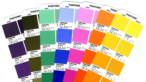
Amid the design-driven revolution, it’s time to ratchet up your color consciousness — or at least take your color wheel out for a spin — to revisit the critical role color plays in exhibit design and effectiveness as well as the basic connotations and emotional reactions associated with specific colors.
Basic Instincts
 If you’re still thinking, “Color is just fluff, and it has no bearing on how my company is perceived or how many leads we collect,” consider your toilet brush.
The funky blue handle on Michael Graves “magic wand” was one of the main reasons you loved the brush. Similarly, color is the shiny bauble that makes you think you need a tongue-brushing toothbrush available in trendy shades of pastel green, blue, purple, and orange — or a dirt-sucking Dyson in shocking shades of pink, purple, yellow, and blue. It’s why Karim Rashid’s “Oh Chair” in jarring red is oh so seductive. It’s why you’re keen on the colorful iPod nano, when Bill Gates is your hero. And it’s why you ignore plain stand mixers and drool over the KitchenAid version, available in hues such as mango, boysenberry, bayleaf, and cinnamon.
“Color is an attention-getting tool — it’s often the first thing the eye sees when it looks at an object,” explains Leatrice Eiseman, color consultant, color forecaster, author, and founder of the Eiseman Center for Color Information and Training in Bainbridge Island, WA. “When it comes to non-verbal communication, color is the most instantaneous way to convey messages and meanings.”
In fact, according to Eiseman, people have no choice but to pay attention to color. “Humans have a psychological, physiological, and associational response to color, which is so engrained in the human psyche that we respond to color without overtly knowing we’ve had a reaction,” says Eiseman, also the director of the Pantone Color Institute, where she participates in research regarding consumer color preferences and contributes to Pantone’s color forecasts.
“For example,” she continues, “humans can’t help but pay attention to red. It’s the color of fire and blood, which are both life sustaining and life threatening. When we see red, there’s a physiological reaction, and we can’t help but pay attention to the color.” This instinctual reaction is exactly why red is used on fire trucks, stop signs, and traffic lights, and why red cars get the most traffic tickets. On the other hand, blue is the color of water and sky — constants in every part of the world and throughout all of human history. Thus, blue conjures associations of constancy, reliability, trustworthiness, and confidence — which is why navy blue is the color of choice for most police uniforms, why surgeons wear blue scrubs, why so many company logos include blue, and why Big Blue isn’t Big Purple.
Colors and Exhibits
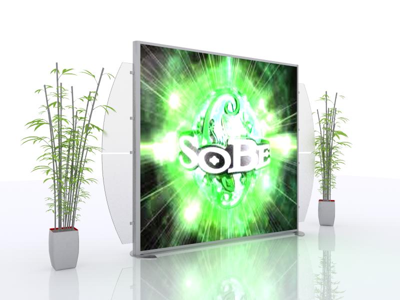 In the world of exhibits, color is the first thing attendees can’t help but see in your booth. When paired with effective design, color is the magnet that draws attendees into your exhibit and out of the sea of sameness that surrounds them.
Once inside your space, color serves multiple purposes — as a non-verbal way-finding tool leading attendees through your exhibit and key areas of interest, a spotlight drawing attention to key products in low-traffic areas, and a psychological alarm clanging out messages in bright shades of red. Color draws attendees’ immediate and instinctual attention, and if the exhibitor has chosen wisely, color speaks volumes without uttering a word.
For more information about trade show or event marketing, give us a call or Contact Us. We welcome the opportunity to assist you with your next show.
Mel White