



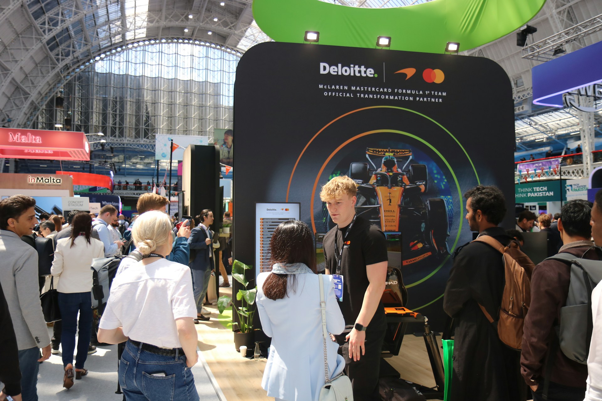
Trade show booths live or die by visual impact. When attendees are walking by in every direction with distractions all around, we only get a few seconds to make a strong impression. That’s where display graphics come into play. A clear, eye-catching setup invites people in. The wrong choices send people walking the other way.
Many of the biggest mistakes with a trade show display graphic are easy to miss until it’s too late. That’s because they’re often small things: spacing, text size, colors that don’t quite pop. These little issues can blur our message fast. With some upfront thinking and the right design knowledge, we can avoid common pitfalls and keep our booth visuals working the way they should.
Picking the Wrong Image Size or Resolution
A grainy or stretched image is hard to miss once it’s up on a backwall. Visitors notice, and not in a good way. Low-quality graphics can make a booth feel rushed or unprofessional, even if everything else looks solid. A pixelated logo, awkward crop, or blurry image pulls focus and raises doubts.
Going too big with the wrong image file causes trouble too. When a small photo is blown up to cover an entire panel, the end result can look distorted or oddly stretched. It is important to match graphic resolution with the final printed size.
Here are a few tips we use when prepping images for our displays:
- Use original files whenever possible instead of online downloads
- Stick to high-resolution formats and avoid resizing after layout
- Double-check image placement and cropping before the final print stage
First Trade Show offers graphic design services and prepares all display graphics for true-size output, using high-resolution files that are optimized for the specific material and booth layout.
Keeping things sharp and sized right helps us make a professional first impression that holds up under close inspection.
Using Too Much Text
Sometimes it feels like we need to get every detail onto the booth. When it comes to display graphics, more words usually mean less clarity. Information overload makes it easy for eyes to skip past what’s important.
At a trade show, people don’t stop to read. They glance, decide, then move, or they don’t. That’s why simple messaging works best. A bold headline, a clean logo, and maybe one or two short phrases can do more than a block of small type ever will. We aim to answer the “what is this?” question within two seconds.
When laying out text:
- Choose three to five words that express our main idea
- Prioritize words that are action-driven or benefit focused
- Use larger type and allow for plenty of breathing room
By keeping our message thin and strong, we give it space to stand out.
Ignoring Color and Contrast
A design that looks great on a screen can get washed out under bright trade show lighting. Colors can disappear completely or blend together once printed on certain materials. Without contrast, nothing pops, and a display that blends into the background is easy to ignore.
This is where booth conditions matter. Most event halls are either brightly lit or use strong overhead lights. Light-colored text on a mid-tone background may vanish from a few feet away.
To avoid these problems:
- Test how colors look in actual lighting or mockups
- Choose bold color pairings that stand out from every direction
- Keep contrast high, especially between text and background
We recommend sampling print colors or requesting soft proofs to preview graphics under real show light if possible, ensuring end results match expectations.
A trade show display graphic that reads well from across the aisle gives us an advantage in crowded environments.
Forgetting Brand Consistency
When logos, fonts, or color schemes don’t match, it breaks trust before a conversation even starts. Booths with great visual ideas can still feel disconnected just because the graphics don’t follow a unified brand style. Visitors notice mismatched messages quickly, even if they can’t explain what feels “off.”
Consistency doesn’t mean repeating the same look everywhere, but it does mean everything should feel like it belongs together. That brand tone, whether it’s bold, clean, modern, or playful, should carry through every panel and graphic.
A few ways we keep things aligned:
- Use approved color palettes and identity fonts across all pieces
- Make sure every logo is clear, scaled correctly, and unaltered
- Match tone and photo style to the overall booth environment
When our display graphics tell the same story, they stay stronger and clearer in people’s minds.
Placing Graphics Too Low or in Busy Areas
Trade show floors are filled with stuff, tables, handouts, staff, and visitors moving around. If our most important graphics end up behind furniture or too close to the ground, they might never be seen.
It’s not just about print design, it’s about how that design fits the physical space. Awkward angles or blocked views steal attention, even from great graphics. We focus on where people’s eyes naturally go, just above standing height and toward the center.
To keep sightlines clear:
- Place key messages 4 to 6 feet off the ground
- Avoid putting important text or images behind tables or chairs
- Use upper panels or banners to anchor the theme from a distance
When we think ahead about layout and how people move through the space, we make sure our message actually reaches them.
Clear Graphics Make a Lasting Impression
Nothing beats a clean, confident booth. At the center of that is a strong trade show display graphic. It’s what people notice first and remember after. When we avoid common design mistakes, we give our booth its best chance to do the talking.
Smart visuals do not have to be flashy or complicated. They just have to be clear, consistent, and easy to see in the chaos of an event. A little attention to detail in the early stages can carry big weight on the show floor. Good graphics keep our message front and center, no matter how crowded it gets.
Clean visuals make a big impact when we want to stand out from the crowd. Getting every detail right in a trade show display graphic helps us present with confidence, creating a booth that is sharp and easy to read from anywhere on the show floor. When our graphics, messaging, layout, and lighting all work together, it clicks for visitors. At First Trade Show, we focus on bringing that clarity to every setup. Reach out so we can discuss what you need for your next event.